New blog design
Posted March 31, 2019
I last redesigned my blog around three years ago — before I started on the rewrite of Gatsby that became Gatsby v1. Which is a long time — and a bummer cause I really enjoy fiddling with my blog design. So #protip — if you want to have time to fiddle with your site’s design, don’t start large open source projects and startups.
But things are a bit less hectic these days (as much as you can ever say that during a startup) as we’ve been able to hire some fantastic people at Gatsby inc. — such that I feel much of the load for making things happen is shared across some very capable shoulders.
So here I am playing with my blog again :-) It was only recently that I got the blog upgraded to Gatsby v2 so definitely it’s been cobbler-children-ized.
Typeface
For the redesign, I used one of my all time favorite typefaces, Cooper Hewitt. Cooper Hewitt is a design museum in NYC (that I really want to visit some time — design museums tend to be favorites). At some point in the past few years, they did a rebrand and commissioned a custom typeface as part of that. Apparently as a design museum, they feel it appropriate to share as widely as possible all designs they create so they open sourced the typeface. Jeremiah Shoaf from Typewolf says it’s his favorite open source font.
I’ve been looking for a chance to use it in a project and this felt like the perfect opportunity.
Homepage
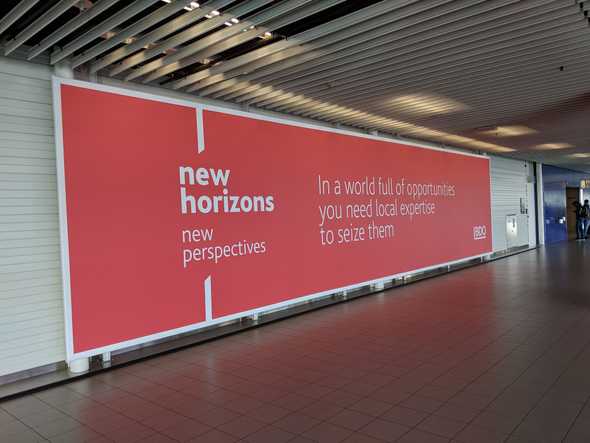
I find airports oddly inspiring design wise. There’s a number of them that have very striking designs. In February I spoke at the Frontend Developer Love conference in Amsterdam and while walking through the airport after deplaning, this banner ad caught my eye.
I loved the typeface, the red, and especially the angled cut-off vertical lines that framed and directed the eye.
Immediately I wanted this as the inspiration for my new blog design.
After returning home I started fiddling. The first challenge was reproducing the vertical lines as CSS doesn’t make that simple. I hit on trying border-radius and after looking at the docs, realized they actually had two potential properties — the second property could make radius elliptical. I played with that until the radius was large enough that the cut-off line was mostly straight.
With a bit of absolute positioning and media queries, I got the the rest of the design working. Then it was just fiddling with the front page copy until it had just the right quirky feel.
Other notes
css-in-js still rocks
It’s so simple to prototype with and refine styles. My previous design was so old that it pre-dates libraries that add the css prop (the full-featured replacement for the classic React styles prop). During this redesign I migrated styles to use Emotion.js
It’s so fast to prototype and refine code when it’s all colocated. Just look at how nice this media query syntax is here:
<h1
  css={{
    width: `80%`,
    color: whitish,
    fontWeight: 600,
    fontSize: scale(5 / 5).fontSize,
    lineHeight: 1.1,
    "@media (min-width: 420px)": {
      fontSize: scale(7 / 5).fontSize,
    },
    "@media (min-width: 768px)": {
      fontSize: scale(10 / 5).fontSize,
    },
  }}
>
  <span css={{ fontWeight: 400 }}>Welcome to the</span> Personal
  Internet Domicile{` `}
  <span css={{ fontWeight: 400 }}>of Kyle Mathews</span>
</h1>
Typography.js
Typography.js is my attempt at making a lib to generate typography CSS from a few base options.
E.g. the options for this site look like this:
let theme = {
  baseFontSize: `18px`,
  headerFontFamily: [`Cooper Hewitt`, `sans-serif`],
  bodyFontFamily: [`Cooper Hewitt`, `sans-serif`],
  plugins: [new CodePlugin()],
  baseLineHeight: 1.45,
  blockMarginBottom: 0.85,
}
I really love how elegant it is — 100s of lines of CSS are generated from less than 10 lines of code. CSS is a really low-level primative for many tasks.
Gatsby
It almost goes without saying that the site is built with Gatsby :-D But just in case, I’ll mention it. Gatsby is sweet and you should use it too.
Subscribe to get updated on new posts!
Kyle Mathews lives and works in Seattle building useful things. You should follow him on Twitter. Currently exploring what's next and open to consulting.

